[Foundations of Data Science] 자살률 분석 (이변량 분석 EDA)
2022. 9. 15. 21:26ㆍ노트/Data Science : 데이터과학
이변량 분석 (Bivariate Analysis)
이변량 분석을 통해서, 2가지 변수를 동시에 분석할 예정이다. 하나의 변수에 대한 특성을 확인하는 단변량 분석 (Univariate Analysis)과는 달리, 이변량 분석 에서는 두가지 변수 사이의 어떤 관계성을 결정할 것이다.
이변량 분석에서 수행하게 되는 3가지 주요한 시나리오는 다음과 같다.
Tip
- [질적(qualitative) data] : 원칙적으로 숫자로 표시될 수 없는 자료 이지만, 측정 대상의 특성을 분류하거나, 확인할 목적으로 숫자를 부여하며, 그 크기가 양적인 크기를 나타내는 것이 아님.
- [양적(quantative) data] : 이산형 자료 (discrete data) vs 연속형 자료 (continuous data) 로 나뉘어 지며, 크기나 양을 숫자로 표현된 데이터
- 관심있는 두 변수 모두 질적 (qualitative) 변수인지
- 한 변수는 질적 (qualitative) 변수이고, 다른 변수는 양적 (quantitative) 변수인지
- 두 변수 모두 양적 (quantitative) 변수인지
분석 목적에 따라, 이변량 분석을 수행하기 위한 몇몇 유명한 기법들을 실행해볼 것이다.
Numerical vs Numerical
1. Scatterplot
2. Line plot
3. Heatmap for correlation
4. Joint plot
Categorical vs Numerical
1. Bar chart
2. Violin plot
3. Categorical box plot
4. Swarm plot
Two Categorical Variables
1. Bar chart
2. Grouped bar chart
3. Point plot
데이터 Source: https://www.kaggle.com/russellyates88/suicide-rates-overview-1985-to-2016
Suicide Rates Overview 1985 to 2016
Compares socio-economic info with suicide rates by year and country
www.kaggle.com
1.1 Loading the libraries
import warnings
warnings.filterwarnings('ignore')

import numpy as np
import pandas as pd
import matplotlib.pyplot as plt
import seaborn as sns
sns.set_style('darkgrid')
1.2 Loading the dataset
data = pd.read_csv('master.csv')1.3 Checking the first 5 rows in the dataset
data.head()
1.4 Checking the descriptive statistics of the data
data.describe()
1.5 Checking the label of each column in the DataFrame
data.columns
>>> Index(['country', 'year', 'sex', 'age', 'suicides_no', 'population',
       'suicides/100k pop', 'country-year', 'HDI for year',
       ' gdp_for_year ($) ', 'gdp_per_capita ($)', 'generation'],
      dtype='object')
1.6 Checking the shape of Dataframe
data.shape
>>> (27820, 12)
1.7 Counting the data types present in the data
data.dtypes.value_counts()
>>> object     6
    int64      4
    float64    2
    dtype: int64
1.8 Checking the short summary of the DataFrame
data.info()
>>> <class 'pandas.core.frame.DataFrame'>
    RangeIndex: 27820 entries, 0 to 27819
    Data columns (total 12 columns):
     #   Column              Non-Null Count  Dtype
    ---  ------              --------------  -----
     0   country             27820 non-null  object
     1   year                27820 non-null  int64
     2   sex                 27820 non-null  object
     3   age                 27820 non-null  object
     4   suicides_no         27820 non-null  int64
     5   population          27820 non-null  int64
     6   suicides/100k pop   27820 non-null  float64
     7   country-year        27820 non-null  object
     8   HDI for year        8364 non-null   float64
     9    gdp_for_year ($)   27820 non-null  object
     10  gdp_per_capita ($)  27820 non-null  int64
     11  generation          27820 non-null  object
    dtypes: float64(2), int64(4), object(6)
    memory usage: 2.5+ MB
1.9 Checking for missing values in the dataset
def missing_check(df):
    total = df.isnull().sum().sort_values(ascending = False) # total value of null values
    percent = (df.isnull().sum() / df.isnull().count()).sort_values(ascending = False) # percentage of values that are null
    missing_data = pd.concat([total, percent], axis = 1 , keys = ['Total', 'Percent'])

    return missing_data

missing_check(data)
# descriptive stats of continuous columns
data[['suicides_no', 'population','suicides/100k pop', 'gdp_per_capita ($)']].describe()
1.10 Frequency table for Age
One-way Tables
my_tab = pd.crosstab(index = data['age'], # Make a crosstab
                     columns = 'count'    # Name the count column
                     )
my_tab
1.11 Bar plot to check the Number of Suicides in top Countries
This is an example of Numerical vs Categorical.
data.groupby(by = ['country'])['suicides_no'].sum().reset_index().sort_values(['suicides_no']).tail(10).plot(x = 'country', y = 'suicides_no', kind ='bar', figsize = (15,5))
- 자살 건수는 러시아가 가장 많고, 미국과 일본이 그 뒤를 잇는다.
- 러시아, 미국, 일본은 다른 나라들에 비해 자살률이 유난히 높다.
1.12 Bar plot to check the bottom 10 countries with the lowest number of suicides
data.groupby(by = ['country'])['suicides_no'].sum().reset_index().sort_values(['suicides_no']
                                                                             , ascending = True).head(10).plot(x = 'country', y = 'suicides_no' , kind = 'bar' , figsize = (15,5))
1.13 Bar plot for Number of Suicides VS Age
plt.figure(figsize = (10,5)) # setting the figure size
ax = sns.barplot(x = 'age', y = 'suicides_no', data = data, palette = 'muted') # barplot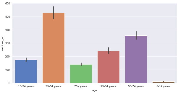
1.14 Bar plot for Number of Suicides VS Sex
plt.figure(figsize = (8,4)) # setting the figure size
ax = sns.barplot(x = 'sex', y = 'suicides_no', data = data , palette = 'muted')
1.15 Bar plot for Number of Suicides VS generation
plt.figure(figsize = (15,5))
ax = sns.barplot(x = 'generation', y = 'suicides_no', data = data)
- 자살률은 Boomers 에서 가장 높고, Generation Z 에서 가장 낮다.
1.16 Scatter plot for Number of Suicides VS population
figure = plt.figure(figsize = (15,5))
ax = sns.scatterplot( x = data['population']
                     ,y = 'suicides_no'
                     ,data = data
                     ,size = 'suicides_no') # scatter plot
figure = plt.figure(figsize = (50,15))
ax = sns.regplot(x = 'population', y = 'suicides_no', data = data)
# Here we plotting a line plot
sns.lineplot(x = 'population', y = 'suicides_no', data = data.head())
Scatter plot for Number of Suicides / 100k Population VS GDP Per Capita
figure = plt.figure(figsize = (15,7))
sns.scatterplot(x = 'gdp_per_capita ($)' , y = 'suicides/100k pop', data = data) # scatter plot
plt.show()
- 낮은 GDP Per Capita 일수록, 살짝 자살률이 높은것 처럼 보인다.
- 하지만, 두 변수 사이에 상당한 상관관계가 있는 것처럼 보이진 않는다.
Checking the correlation among pairs of continuous variables
plt.figure(figsize = (10, 5))
sns.heatmap(data.corr(), annot = True, linewidths = 0.5, fmt = '.1f' , center = 1) # heatmap
plt.show()
- 단순히 df.corr() 하기 보다, 많은 변수들이 있을 때, heatmap을 사용해 볼 수 있다.
- 색깔이 가장 상관되어 있는 것들을 쉽게 고를 수 있도록 도와준다.
- 색깔이 짙을 수록 상관관계가 더 높아진다.
- 어떤 속성들도 상당히 중요한 상관관계를 가지고 있는 것 처럼 보이지 않는다.
- 몇몇 명백한 상관 관계는, 인구가 많을 수록, 자살 건수가 더 많을 가능성이 높다.
- Human Development Index - gdp per capita 도 높은 상관관계를 가지는 유일한 쌍이다.
1.17.1 Bar plot to check Number of suicides by sex and age (three variables used to generate a single plot)
plt.figure(figsize = (15,5))
sns.barplot(data = data , x = 'sex' , y = 'suicides_no', hue ='age')
plt.show()
1.17.2 Bar plot to check Number of suicides by sex and Generation (three variables used to generate a single plot)
plt.figure(figsize = (15,5))
sns.barplot(data = data, x = 'sex', y = 'suicides_no', hue = 'generation')
plt.show()
- 남성 자살은 나이많은 세대를 제외하고, 여성 자살에 비해 세대간 분포에 약간 차이가 있다.
- 남성과 여성 둘다 Boomers 세대에서 자살 건수가 가장 많다.
1.18 Checking the No.of suicides: Country VS Sex
suic_sum_m = data['suicides_no'].groupby([data['country'] , data['sex']]).sum() # number of suicides by country and sex
suic_sum_m = suic_sum_m.reset_index().sort_values(by = 'suicides_no', ascending = False) # sort in descending order
most_cont_m = suic_sum_m.head(10) # getting the top ten countries in terms of suicides

fig = plt.figure(figsize = (15, 5))
plt.title('Count of suicides for 31 years')

sns.barplot(y = 'country', x = 'suicides_no', hue = 'sex', data = most_cont_m, palette = 'Set2')
plt.ylabel('Count of suicides')
plt.tight_layout()
- 높은 자살률을 가지는 다른 도시들과 비교했을 때, 일본이 여성 자살 비율이 더 높다.
Average number of suicides across each generation for a given gender along with the confidence intervals - Point Plot
plt.figure(figsize = (15,5))

sns.pointplot(x = 'generation', y = 'suicides_no', hue = 'sex', data = data)
plt.show()
- 이 그래프는 신뢰 구간 내에서 평균적인 자살 건수를 말해준다.
- 여성 자살 건수는 일반적으로 많은 변동성이 있어보이지 않는다.
- Gen-Z 세대의 평균 자살 건수는 성별 사이에서 거의 동일하게 분포되어 있다.
Distribution of population across each generation - Violin plot
plt.figure(figsize = (10,5))
sns.violinplot(x = data.generation, y = data['population'])
plt.show()
- 위 plot은 box plot과 비슷해 보이지만, 여기서는 밀도 함수를 얻을 수 있다.
- 모든 세대에 대한 인구 분포는 상당히 치우쳐져 있다. (highly skewed)
- 잠재적인 아웃라이어들이 많다.
- 진짜 각 세대별 인구들에 대한 아웃라이더들이 많은지 스스로 확인해봐라. (Hint : use a boxplot)
plt.figure(figsize = (10,5))
sns.boxplot(x = data.generation, y = data.population)
plt.show()
Checking trends with the Temporal Data
시간 데이터는 1990년대 홍콩의 토지 사용 패턴이나, 2009년 7월 1일 호놀룰루의 전체 강수량 과 같은 시간 별 상태를 나타내는 데이터 이다. 시간 데이터는 계절 패턴, 다른 환경 변수들, 교통 상태 모니터링, 인구 통계학 트렌드 연구 등을 분석하기 위해 수집된다. 이 데이터는 수동 데이터 입력이나, 관찰 센서를 사용하여 수집되거나, 시뮬레이션 모델에서 생성된 데이터에 이르는 다양한 소스로 부터 가져온다.
Checking pattern using Trend plot (1985-2015) suides Rate VS Years
data[['year' , 'suicides_no']].groupby(['year']).sum().plot(figsize = (15,5))

plt.show()
Checking the pattern using Trend plot (1985-2015) Population VS Years
data[['year' , 'population']].groupby(['year']).sum().plot(figsize = (15,5))

plt.show()
data[['year' , 'suicides/100k pop']].groupby(['year']).sum().plot(figsize = (15,5))

plt.show()
'노트 > Data Science : 데이터과학' 카테고리의 다른 글
| [Foundation of Data Science] 가설 검정 프레임워크 (0) | 2024.04.09 |
|---|---|
| [Naver Deview 2021] ClickHouse (클릭하우스) 리뷰 (1) | 2024.03.26 |
| [Foundation of Data Science] 가설 검정 (0) | 2023.11.05 |
| [Foundation of Data science] 추론 통계 (0) | 2022.12.10 |
| [Foundations of Data Science] 유산소 운동 피트니스 분석 (기술통계 분석 EDA) (0) | 2022.11.06 |