2021. 6. 13. 13:40ㆍ레퍼런스/Kaggle
출처 :
https://www.kaggle.com/ash316/eda-to-prediction-dietanic#
EDA To Prediction(DieTanic)
Explore and run machine learning code with Kaggle Notebooks | Using data from Titanic - Machine Learning from Disaster
www.kaggle.com
EDA To Prediction (DieTanic)
1. Explorartory Data Anlysis(EDA)
import numpy as np
import pandas as pd
import matplotlib.pyplot as plt
import seaborn as sns
plt.style.use('dark_background')
import warnings
warnings.filterwarnings('ignore')
%matplotlib inline
data = pd.read_csv('./train.csv')
data.head()
data.isnull().sum() # checking for total null values

>>>
PassengerId      0
Survived         0
Pclass           0
Name             0
Sex              0
Age            177
SibSp            0
Parch            0
Ticket           0
Fare             0
Cabin          687
Embarked         2
dtype: int64
Age, Cabin , Embarked 변수 결측치 처리 필요
1.0.1 얼마나 생존한지 확인해보기
f, ax = plt.subplots(1,2, figsize = (18,8))
data['Survived'].value_counts().plot.pie(explode = [0,0.1],
                                         autopct = '%1.1f%%',
                                         ax = ax[0],
                                         shadow = True)
ax[0].set_title('Survived')
ax[0].set_ylabel('')
sns.countplot('Survived', data = data , ax = ax[1])
ax[1].set_title('Survived')
plt.show()- 많은 승객이 사고로 생존하지 않은 것은 명백함
- 승객 891명중 대략 350명만 생존함. 즉, 전체 training set의 38.4% 만 충돌로 생존함.
- 데이터로 부터 더 많은 인사이트를 얻기 위해, 좀 더 들어가보면,
- 어떤 카테고리의 승객이 생존했고, 사망했는지 알 수 있음
- dataset의 서로 다른 features를 사용하여 생존 률을 확인해보겠음.
- feature는 Sex, Port of Embarcation (탑승 항구), Age, 등을 말함.
- 첫번째로 feature의 다른 type을 이해해보자.
1.0.2 Features의 Type
< Categorical Features (범주형 변수) >
범주형 변수는 2개 이상의 범주를 가지며, 각 feature 내의 값들이 카테고리들로 분류되는 변수들을 의미함.
예를들어, gender는 두개의 카테고리를 가지는 범주형 변수임 ( male 과 female )
이 변수들은 순서를 매길 수 없음. Norminal 변수 라고도 알려짐
이 데이터 셋의 Categorical Features : Sex, Embarked.
< Ordinal Features (순서형 변수) >
순서형 변수는 범주형 변수와 비슷하나, 값들 사이에 순서로 분류할 수 있다는 점에서 차이가 있음.
예를 들어, Tall, Medium, Short 값을 가지는 Height 같은 변수라면, Height는 순서형 변수임.
이 데이터 셋의 Ordinal Features : PClass
< Continuous Features (연속형 변수) >
어떤 두 점 혹은 feature의 최대 최소값 사이에서 어떤 값이든 가질 수 있는 변수를 연속형 변수라고 함.
이 데이터 셋의 Continuous Features : Age
1-1. Analysis of the features
1-1-1. Sex -> Categorical Feature
data.groupby(['Sex','Survived'])['Survived'].count()

>>>
Sex     Survived
female  0            81
        1           233
male    0           468
        1           109
Name: Survived, dtype: int64
f, ax = plt.subplots(1,2, figsize = (18,8))
data[['Sex', 'Survived']].groupby(['Sex']).mean().plot.bar(ax = ax[0])
ax[0].set_title('Survived vs Sex')
sns.countplot('Sex', hue = 'Survived', data = data , ax = ax[1])
ax[1].set_title('Sex: Survived vs Dead')
plt.show()- 배안의 남자들의 수가 여자들의 수보다 더 많음.
- 또 생존한 여자들의 수가 거의 생존한 남자들의 수의 두배에 가까움
- 배 안의 여자들이 생존할 확률은 대략 75% 정도 이고, 남자들은 18-19% 정도임
- 모델링에 매우 중요한 feature임.
1-1-2. Pclass -> Ordinal Feature
pd.crosstab(data.Pclass, data.Survived, margins = True).style.background_gradient(cmap = 'summer_r')f, ax = plt.subplots(1,2, figsize = (18,8))
data['Pclass'].value_counts().plot.bar(color = ['#CD7F32', '#FFDF00', '#D3D3D3'], ax = ax[0])
ax[0].set_title('Number Of Passengers By Pclass')
ax[0].set_ylabel('Count')
sns.countplot('Pclass', hue = 'Survived', data = data, ax = ax[1])
ax[1].set_title('Pclass: Survived vs Dead')
plt.show()사람들은 돈은 모든 것을 살 수 없다고 말한다. 하지만, 명백히 1 Pclass의 승객들은 구조하는 동안에 높은 우선순위에 고려되었음을 명백히 확인할 수 있다. Pclass3 의 승객 수가 더 많았음에도 불구하고, 여전히 그들의 생존 수는 매우 낮다. 대략 25% 정도이다.
Pclass 1의 생존률은 대략 63% 이다. 반면에 Pclass 2의 생존률은 48% 이다. 그래서 이런 자본주의 사회에서는 돈과 지위가 중요하다.
좀 더 들어가서 흥미로운 관찰을 확인해보자. Sex 와 Pclass 를 함께 고려한 생존률을 확인해보자
pd.crosstab([data.Sex, data.Survived], data.Pclass, margins = True).style.background_gradient(cmap='summer_r')sns.factorplot('Pclass', 'Survived', hue = 'Sex', data = data)
plt.show()factorPlot을 사용했다. 범주형 변수들을 매우 쉽게 분리해주기 때문이다.
CrossTab과 FactorPlot을 보자. 우리는 쉽게 Pclass1의 여성의 생존률이 대략 95-96% 가 됨을 추론할 수 있다. Pclass1의 여성 94명중 오직 3명만 사망했다.
구조하는 동안, 여성이 최 우선적으로 고려되었다는 것은 Pclass에 상관없이 명백하다.
심지어 Pclass1의 남자들도 매우 낮은 생존률을 보였다.
Pclass는 중요한 feature인 것으로 보인다. 다른 features들도 분석해보자.
1-1-3. Age -> Continuous Feature
print('Oldest Passenger was of:', data['Age'].max(), '세')
print('Youngest Passenger was of:', data['Age'].min(), '세')
print('Average Age on the ship: ', data['Age'].mean(), '세')

>>> Oldest Passenger was of: 80.0 세
    Youngest Passenger was of: 0.42 세
    Average Age on the ship:  29.69911764705882 세
f, ax = plt.subplots(1, 2, figsize = (18,8))
sns.violinplot('Pclass', 'Age', hue = 'Survived', data = data, split= True, ax = ax[0])
ax[0].set_title('Pclass and Age vs Survived')
ax[0].set_yticks(range(0,110,10))
sns.violinplot('Sex', 'Age', hue = 'Survived', data = data, split = True, ax = ax[1])
ax[1].set_title('Sex and Age vs Survived')
ax[1].set_yticks(range(0,110,10))
plt.show()
관찰:
1) 어린이의 수가 Pclass가 높아질 수록 증가하고, 10살 이하(즉, 어린이)의 승객의 생존률 Pclass에 무관한 것으로 보임.
2) Pclass 1의 20-50살 승객의 생존률 변화는 높고, 여성의 경우 더 생존률이 높음
3) 남성의 경우, 생존률 변화는 나이가 증가할 수록 감소함.
앞에서 봤듯이, Age feature는 177 개의 결측치 값이 있음. NaN값을 대체하기 위해서, dataset의 평균 나이로 할당할 수 있음.
하지만 문제는, 여기에 매우 많은 사람들이 다른 나이를 가졌다는 것임. 4살짜리 아이를 29살 의 평균 나이로 할당할 수는 없을 것임. 승객들이 놓인 연령대를 찾는 어떤 방법이 있을까??
Bingo!!! 우리는 Name feature를 확인할 수 있음. feature를 잘 들여다 보면, 우리는 name이 Mr또는 Mrs 와 같은 정중한 표현을 가진다는 것을 확인할 수 있음. 그래서 Mr 와 Mrs의 평균 값을 각각의 그룹에 할당할 수 있음.
"Name"에 무엇이 있다고?? -----> Feature! :p
data['Initial'] = 0
for i in data:
    data['Initial'] = data.Name.str.extract('([A-Za-z]+)\.') # Salutations을 추출하자
여기서 정규표현식(Regex: [A-Za-z]+). 를 사용했다. 이게 무엇을 의미하냐면, A-Z 또는 a-z 사이에 있는 문자열과 다음에 .(점) 이 오는 문자열을 찾는다. 그래서 Name 으로 부터 이니셜을 성공적으로 추출할 수 있다.
pd.crosstab(data.Initial, data.Sex).T.style.background_gradient(cmap = 'summer_r') # 성별에 따라 이니셜 확인 Okay, Miss를 의미하는 Mlle 이나 Mme 처럼 여기에 몇몇 오타난 이니셜도 있는것 같다. 오타난 값들을 Miss로 대체하겠다.
data['Initial'].replace(['Mlle','Mme','Ms','Dr','Major',
                         'Lady','Countess','Jonkheer',
                         'Col','Rev','Capt','Sir','Don'],
                        ['Miss','Miss','Miss','Mr','Mr',
                         'Mrs','Mrs','Other',
'Other','Other','Mr','Mr','Mr'], inplace = True)data.groupby('Initial')['Age'].mean() # Initial에 따라 평균 나이를 확인해보자
>>>
Initial
Master 4.574167
Miss 21.860000
Mr 32.739609
Mrs 35.981818
Other 45.888889
Name: Age, dtype: float64나이 결측치 (NaN 값) 처리
## 위의 평균 나이 값을 NaN 값에 할당
data.loc[(data.Age.isnull()) & (data.Initial == 'Mr'), 'Age'] = 33
data.loc[(data.Age.isnull()) & (data.Initial == 'Mrs'), 'Age'] = 36
data.loc[(data.Age.isnull()) & (data.Initial == 'Master'), 'Age'] = 5
data.loc[(data.Age.isnull()) & (data.Initial == 'Miss'), 'Age'] = 22
data.loc[(data.Age.isnull()) & (data.Initial == 'Other'), 'Age'] = 46 data.Age.isnull().any() # Null value 확인
>>> Falsef, ax = plt.subplots(1,2 , figsize = (20,10))
data[data['Survived'] == 0].Age.plot.hist(ax = ax[0], bins = 20, edgecolor = 'black', color = 'red')
ax[0].set_title('Survived = 0')
x1 = list(range(0,85,5))
ax[0].set_xticks(x1)
data[data['Survived'] == 1].Age.plot.hist(ax = ax[1], color = 'green', bins = 20, edgecolor = 'black')
ax[1].set_title('Survived = 1')
x2 = list(range(0,85,5))
ax[1].set_xticks(x2)
plt.show()관찰:
1) 아기 (age < 5)는 많은 수가 생존하였다. (여자와 아이가 최우선적으로 고려되었다.)
2) 가장 나이가 많은 승객도 생존하였다. (80 살)
3) 30-40 대 나이 그룹에서 사망한 사람의 수가 최대이다.
sns.factorplot('Pclass', 'Survived', col = 'Initial', data = data)
plt.show()
여자와 아이가 구출에 최우선적으로 고려되었고, 그래서 class 에 상관 없어 보인다.
1-1-4. Embarked -> Categorical Value
pd.crosstab([data.Embarked, data.Pclass], [data.Sex, data.Survived], margins = True).style.background_gradient(cmap='summer_r')탑승 항구에 따른 생존률 변화
sns.factorplot('Embarked', 'Survived', data = data)
fig = plt.gcf()
fig.set_size_inches(5,3)
plt.show()
Port C의 생존률 변화가 대략 0.55로 가장 컸고, S가 가장 작았다.
f, ax = plt.subplots(2,2, figsize = (20,15))
sns.countplot('Embarked', data = data, ax = ax[0,0])
ax[0,0].set_title('No. Of Passengers Boarded')
sns.countplot('Embarked', hue = 'Sex', data = data, ax = ax[0,1])
ax[0,1].set_title('Male-Female Split for Embarked')
sns.countplot('Embarked', hue = 'Survived', data = data, ax = ax[1,0])
ax[1,0].set_title('Embarked vs Survived')
sns.countplot('Embarked', hue = 'Pclass', data = data, ax = ax[1,1])
ax[1,1].set_title('Embarked vs Pclass')
plt.subplots_adjust(wspace = 0.2, hspace = 0.5)
plt.show()
관찰:
1) S에서 탑승한 승객 수가 최대임. 다수는 Pclass3에 속함
2) C에서 탑승한 승객은 생존률이 좋은것으로 보아 행운이 있었던 것으로 보임. 아마 Pclass1와 Pclass2의 승객들이 구출됬기 때문이 아닐까 싶음.
3) 항구 S는 대부분의 승객들이 돈 많은 사람들인 것으로 보임. 여전히 생존률 변화는 낮은것으로 보이나. 이는 Pclass3의 승객이 대략 81% 나 생존하지 못했기 때문임.
4) Port Q는 거의 95%의 승객들이 Pclass 3 소속임
sns.factorplot('Pclass', 'Survived', hue = 'Sex', col = 'Embarked', data = data)
plt.show()
관찰:
1) Pclass1과 Pclass2의 여성들의 생존률 변화는 거의 1인 것으로 보아, Pclass에 관련 없는 것 같음
2) Port S는 Pclass3 승객들에게 남자든 여자든 생존률이 매우 낮아 불행한 것으로 보임. (돈이 중요)
3) Port Q는 특히 남자한테 불행함. 거의 Pclass3 소속이기 때문
Embarked 결측치 채우기
대부분의 승객들이 Port S에서 탑승했기 때문에, NaN값을 S로 채우겠음
data['Embarked'].fillna('S', inplace = True)

data.Embarked.isnull().any() # No NaN 값 확인
>>> False
1-1-5. SibSip -> Discrete Feature
이 feature는 사람이 혼자 였는지, 그의 가족과 함께 있는지를 나타냄.
Sibling = brother, sister, stepbrother, stepsister
Spouse = husband, wife
pd.crosstab([data.SibSp], data.Survived).style.background_gradient(cmap = 'summer_r')# f, ax = plt.subplots(1,2, figsize = (20,8))
sns.barplot('SibSp', 'Survived', data= data).set_title('SibSp vs Survived')
plt.show()f = sns.factorplot('SibSp', 'Survived', data=data)
f.fig.suptitle('SubSp vs Survived')pd.crosstab(data.SibSp, data.Pclass).style.background_gradient(cmap= 'summer_r')관찰:
barplot 과 factorplot는 만약 승객이 형제 자매 없이 혼자 배에 탑승했다면, 34.5% 생존률을 가짐.
그래프는 형제 자매 수가 증가할 수록 감소함. 합리적임 .
즉, 만약 내 가족이 배에 탑승했다면, 나를 먼저 구출하려고 하기 보다 그들을 구출하려고 했을거임.
놀랍게도 5-8명의 가족을 구성한 사람들의 생존률은 0% 였음.
이유가 아마도 Pclass때문이지 않을까?
이유는 Pclass 때문임. crosstab이 SibSp > 3인 사람들이 모두 Pclass3에 있었다는 것을 보여줌.
Pclass3에 있는 대가족들은 모두 사망하고 맘.
1-1-6. Parch
pd.crosstab(data.Parch, data.Pclass).style.background_gradient(cmap = 'summer_r')이 crosstab은 다시한번 Pclass3에서 더 큰 가족들이 있었다는 사실을 보여줌
# f, ax = plt.subplots(1,2 , figsize = (20,8))
sns.barplot('Parch', 'Survived', data = data).set_title('Parch vs Survived')

plt.show()
f = sns.factorplot('Parch', 'Survived', data = data)
f.fig.suptitle('Parch vs Survived')
plt.show()관찰:
여기도 역시 결과가 꽤 유사하다. 그들의 부모가 탑승한 승객들은 생존할 확률이 더 컸다. 하지만 수가 증가할 수록 감소하였다.
1-3 명의 부모가 배에 탑승한 사람의 생존률은 꽤 좋다.
혼자 있는것 또한 치명적임이 증명됬다. 그리고 >4 의 부모가 탑승한 경우에는 생존률의 변화율이 감소했다.
1-1-7. Fare -> Continuous Feature
print('Highest Fare was:', data['Fare'].max())
print('Lowest Fare was:', data['Fare'].min())
print('Average Fare was:', data['Fare'].mean())

>>> Highest Fare was: 512.3292
    Lowest Fare was: 0.0
    Average Fare was: 32.2042079685746
가장 낮은 요금은 0.0 이다. Wow! 무료 럭셔리 탑승이라니~!
f, ax = plt.subplots(1,3, figsize = (20,8))
sns.distplot(data[data['Pclass']==1].Fare, ax = ax[0], color ='w')
ax[0].set_title('Fares in Pclass 1')

sns.distplot(data[data['Pclass']==2].Fare, ax = ax[1], color ='w')
ax[1].set_title('Fares in Pclass 2')

sns.distplot(data[data['Pclass']==3].Fare, ax = ax[2], color ='w')
ax[2].set_title('Fares in Pclass 3')
plt.show()
Pclass 1의 탑승객들의 요금이 큰 분포를 가지는 것으로 보임. 그리고 이 분포는 표준이 줄어들면서 감소함.
이것이 연속이기 때문에, binning (이진화)를 사용해서 이산 변수로 바꿀 수 있음
모든 features에 대한 관찰:
Sex: 여성의 생존 가능성은 남성과 비교했을 때, 높다.
Pclass: 1st class 탑승객이 생존에 더 나은 가능성을 보여주는 명백한 트렌드가 있다.
Pclass3의 생존률은 매우 낮다. 여성의 경우, Pclass의 생존 가능성은 거의 1이며,
Pclass2의 여성의 경우도 역시 높다. 돈이 이긴다!!
Age: 5-10 살 이하의 어린이도 높은 생존 가능성을 가진다. 15세-35세 사이의 연령대의 탑승객이 가장 많이 사망하였다.
Embarked: : 이는 매우 흥미로운 feature이다. 심지어 C에서 생존 가능성은 S에서 탑승한 Pclass1 의 대다수 보다 더 좋은 것으로 보인다. Q에서 탑승한 승객들은 거의 Pclass 3 소속이다.
Parch + SibSp: 1-2의 형제자매, 배우자가 탑승하거나 1-3 의 부모가 탑승한다면, 혼자 탑승하거나 대 가족이 함께 여행하는 것보다 더 나은 생존 확률을 보여준다.
1-2. Finding any relations or trends considering multiple features
1-2-1. Feature 사이의 상관관계
sns.heatmap(data.corr(), annot = True, cmap = 'RdYlGn', linewidths = 0.2)
#data.coor() --> correlation matrix
fig = plt.gcf()
fig.set_size_inches(10,8)
plt.show()
Heatmap 해석
첫번째로 주의해야할 점은 알파벳과 문자열의 상관관계가 없는 것이 분명하기 때문에 숫자적 특징만 비교된다는 것이다. 그림을 이해하기 전에, 상관관계가 무엇인지 정확하게 이해하자.
긍정적인 상관관계: 만약, 한 feature A의 증가가 feature B의 증가를 초래한다면, 이들은 긍정적인 상관관계가 있는 것이다. 값 1 은 완벽한 양의 상관관계를 의미한다.
부정적인 상관관계: 만약 한 feature A의 증가가 feature B의 감소를 초래한다면, 이들은 부정적인 상관관계가 있는 것이다. 값 -1 은 완벽한 음의 상관관계를 의미한다.
이제 두 featrues들이 상당히 완벽하게 상관되어 있다고 하자, 그러면, 한 feature의 증가가 다른 feature의 증가를 이끈다. 이것은 features들이 꽤 유사한 정보를 가지고 있다는 것을 의미하며, 정보에 분산이 거의 없다는 것을 의미한다. 이것은 다중공선성(MultiColinearity) 라고 알려져 있으며, 그들 모두 거의 같은 정보를 담고 있다는 것을 의미한다.
둘 중 하나가 불필요하므로 두가지를 모두 사용해야 한다고 생각하나요? 모델을 만들거나 학습하는 동안, 우리는 불필요한 feature들을 제거해야 하며, 이는 학습 시간을 줄여주며 많은 이점들이 있습니다.
이제 위의 heatmap를 보면, feature들이 그렇게 많이 상관되어 있는 것 같진 않습니다.
가장 높은 상관관계는 0.41의 SipSp 와 Parch 입니다. 그래서 우리는 모든 feature들을 다루겠습니다.
2. Feature Enginerring and Data Cleaning
이제 Feature Engineering이 무엇인지 알아보자.
우리가 feature가 있는 dataset을 받을 때마다, 모든 feature들이 중요하다고 고려하는 것은 불필요할 것입니다.
제거되어야 하는 불필요한 feature이 많이 있을지도 모르기 때문입니다.
또한 다른 feature들로 부터 정보를 추출하거나 관찰함으로써 새로운 feature들을 얻거나 추가할 수도 있습니다.
Name Feature을 사용하여 Initial feature를 얻은것을 한 예로 들 수 있습니다.
만약 새로운 feature들을 얻거나 조금 제거하여 확인해보겠습니다. 또한 우리는 예측 모델에 적합한 형태로 관련된 feature들을 변형할 수도 있습니다.
2.0.1 Age Feature의 문제
Age가 연속적인 feature라고 위에서 언급했듯이, 머신러닝 모델에서 연속 변수는 한가지 문제점이 있습니다.
Eg: 만약 내가 성별로 나뉘어진 스포츠 선수들을 그룹짓거나 정렬할때, 우리는 쉽게 남자와 여자로 그들을 나눌 수 있습니다.
이제 만약 그들을 나이에 의해 그룹짓는 다고 한다면, 당신은 어떻게 하겠습니까?
만약 30명의 사람이 있다면, 아마 30개의 age 값이 있을 겁니다 . 이것은 문제입니다.
우리는 이 연속적인 값을 범주형 값으로 Binning이나 Normalisation을 사용하여 변환할 필요가 있습니다.
나는 binning(이진화)를 사용할 것입니다. 즉, 나이의 범위를 하나의 bin로 그룹화 하거나 혹은 하나의 값으로 할당할 것입니다.
네, 그럼 탑승객의 나이의 최대값은 80이었습니다. 그래서 0-80까지의 나이를 5구간으로 나누어 봅시다.
그럼 80/5 = 16이기 때문에 bin의 크기는 16입니다
data['Age_band'] = 0
data.loc[data['Age'] <= 16, 'Age_band'] = 0
data.loc[(data['Age'] > 16) & (data['Age'] <= 32), 'Age_band'] = 1
data.loc[(data['Age'] > 32) & (data['Age'] <= 48), 'Age_band'] = 2
data.loc[(data['Age'] > 48) & (data['Age'] <= 64), 'Age_band'] = 3
data.loc[data['Age'] > 64 , 'Age_band'] = 4
data.head(2)data['Age_band'].value_counts().to_frame().style.background_gradient(cmap = 'summer')
# checking the number of passengers in each band sns.factorplot('Age_band', 'Survived', data = data, col = 'Pclass')
plt.show()진실은.. 나이가 증가할수록 생존률이 감소하는 것으로 보아 Pclass와는 관련 없는 것 같네요.
2.0.2 Famliy_size 와 Alone
이런 관점에서, 우리는 'Family_size'와 'Alone'이라 불리는 새로운 feature를 만들어내고, 분석할 수 있습니다.
이 Feature는 Parch와 SibSp를 합한 것입니다. 이는 우리에게 결합된 데이터를 제공하여, 생존률이 탑승객의 가족 크기와 관련되었는지 확인할 수 있습니다. Alone은 탑승객이 혼자였는지 아니였는지를 나타내겠습니다.
data['Family_size'] = 0
data['Family_size'] = data['Parch'] + data['SibSp'] # Family size
data['Alone'] = 0
data.loc[data.Family_size == 0, 'Alone'] = 1 # Alone

f1 = sns.factorplot('Family_size', 'Survived', data = data, ax = ax[0])
f1.fig.suptitle('Family_Size vs Survived')

f2 = sns.factorplot('Alone', 'Survived', data = data , ax = ax[1])
f2.fig.suptitle('Alone vs Survived')
plt.show()
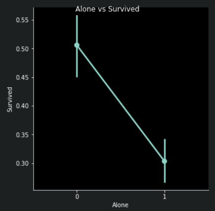
Family_size = 0은 탑승객이 혼자였다는 것을 의미합니다.
정확하게, 만약 당신이 혼자였거나 family_size = 0 이라면, 생존 가능성은 매우 낮았을 것입니다.
가족 크기가 > 4 이상이어도 생존 가능성은 역시 감소합니다. 이는 또한 모델에 중요한 feature인 것으로 보입니다.
조금 더 실험해봅시다.
sns.factorplot('Alone', 'Survived', data = data , hue = 'Sex', col = 'Pclass')
plt.show()
혼자 있는 것이 성별이느 Pclass와 관계 없이 나쁘다는 것을 볼 수 있습니다.
Pclass3만 제외하고 말이죠, Pclass3에서는 혼자 있는 여성의 가능성이 가족과 함께 있는 것보다 높습니다.
2.0.3 Fare_Range (요금 범위)
fare가 또한 연속적인 feature이기 때문에, 우리는 순서형 변수(ordinal) 로 변환할 필요가 있습니다.
이를 위해서 우리는 pandas.qcut을 사용하겠습니다.
qcut은 우리가 전달하는 bins의 수에 따라 값을 분할하거나 정렬합니다.
그래서 만약에 우리가 5 bins를 전달한다면, qcut은 값을 똑같이 5개의 분할된 bins 또는 값 범위로 나누어 정렬할 것입니다.
data['Fare_range'] = pd.qcut(data['Fare'], 4)
data.groupby(['Fare_range'])['Survived'].mean().to_frame().style.background_gradient(cmap = 'summer_r')
우리가 위에서 논의했듯이, 명백하게 fare_range가 증가할 수록 생존 가능성도 증가하는 것을 볼 수 있습니다.
이제 우리는 Fare_range 값을 전달할 수 없습니다. 우리는 이를 Age_Band에서 했던 것처럼 단독 값으로 변환해야합니다.
data['Fare_cat'] = 0
data.loc[data['Fare'] <= 7.91, 'Fare_cat'] = 0
data.loc[(data['Fare'] > 7.91) & (data['Fare'] <= 14.454), 'Fare_cat'] = 1
data.loc[(data['Fare'] > 14.454) & (data['Fare'] <= 31), 'Fare_cat'] = 2
data.loc[(data['Fare'] > 31) & (data['Fare'] <= 513), 'Fare_cat'] = 3 sns.factorplot('Fare_cat', 'Survived', data = data , hue= 'Sex')
plt.show()명백하게, Fare_cat이 증가할 수록 생존 가능성은 증가합니다. 이 faeture는 성별에 따라 중요한 feature가 될 수 있을 것 같습니다.
문자열 값을 숫자형으로 변환하기
우리가 string을 머신러닝 모델에 전달할 수 없기 때문에, Sex, Embarked, etc 와 같은 변수들을 숫자형 값으로 바꿔줘야합니다.
data['Sex'].replace(['male', 'female'] , [0,1], inplace = True)
data['Embarked'].replace(['S', 'C', 'Q'], [0,1,2], inplace = True)
data['Initial'].replace(['Mr', 'Mrs', 'Miss', 'Master','Other'], [0,1,2,3,4], inplace = True)
불필요한 Features을 drop하기
Name -> 어떤 범주형 변수로 변환할 수 없기 때문에 우리는 name feature를 필요로 하지 않습니다.
Age -> Age_band feature가 있기 때문에 이 변수가 필요 없습니다.
Ticket -> 랜덤 스트링이기 때문에 범주화될 수 없습니다.
Fare -> Fare_cat feature가 있기 때문에 필요없습니다.
Cabin -> 많은 NaN값들과 많은 탑승객들이 다수의 cabins을 가지고 있습니다. 그래서 불필요한 feature입니다.
Fare_range -> fare_cat feature를 가지고 있습니다.
PassengerId -> 범주화 할 수 없습니다.
data.drop(['Name', 'Age', 'Ticket', 'Fare', 'Cabin', 'Fare_range', 'PassengerId'], axis = 1, inplace = True)
sns.heatmap(data.corr(), annot = True, cmap = 'RdYlGn', linewidths = 0.2, annot_kws = {'size': 20})
fig = plt.gcf()
fig.set_size_inches(18,15)
plt.xticks(fontsize = 14)
plt.yticks(fontsize = 14)
plt.show()
이제, 위의 상관관계 그림에서 우리는 feature에 긍정적인 상관관계가 있음을 확인할 수 있습니다.
SibSp 와 Family_size 그리고 Parch 와 Family_size 가 그렇고,
Alone 과 Family_size에는 부정적인 관계가 있네요.
3. Predictive Modeling
우리는 EDA part에서 몇몇 인사이트를 얻었습니다. 하지만, 우리는 이것 만으로는 정확하게 탑승객이 생존하는지 사망하는지 예측하거나 말할 수 없습니다.
그래서 지금부터 우리는 탑승객이 생존할 것인지 사망할 것인지 훌륭한 분류 알고리즘을 사용하여 예측해볼 것입니다.
다음 알고리즘을 사용하여 모델을 만들어보겠습니다.
1) Logistic Regression
2) Support Vector Machines (Linear and radial)
3) Random Forest
4) K-Nearest Neighbours
5) Naive Bayes
6) Decision Tree
7) Logistic Regression
3-1. Running Basic Algorithms
# importing all the required ML packages
from sklearn.linear_model import LogisticRegression
from sklearn import svm
from sklearn.ensemble import RandomForestClassifier
from sklearn.neighbors import KNeighborsClassifier
from sklearn.naive_bayes import GaussianNB
from sklearn.tree import DecisionTreeClassifier
from sklearn.model_selection import train_test_split
from sklearn import metrics
from sklearn.metrics import confusion_matrix
train, test = train_test_split(data, test_size = 0.3, random_state = 0,
stratify = data['Survived'])
train_X = train[train.columns[1:]]
train_Y = train[train.columns[:1]]
test_X = test[test.columns[1:]]
test_Y = test[test.columns[:1]]
X = data[data.columns[1:]]
Y = data['Survived']
Radial Support Vector Machines (rbf-SVM)
model = svm.SVC(kernel = 'rbf', C = 1, gamma = 0.1)
model.fit(train_X, train_Y)
prediction1 = model.predict(test_X)
print('Accuracy for rbf SVM is ', metrics.accuracy_score(prediction1, test_Y))

>>> Accuracy for rbf SVM is  0.835820895522388
Linear Supoort Vector Machines (linear-SVM)
model = svm.SVC(kernel = 'linear', C = 0.1, gamma = 0.1)
model.fit(train_X, train_Y)
prediction2 = model.predict(test_X)
print('Accuracy for linear SVM is ', metrics.accuracy_score(prediction2, test_Y))

>>> Accuracy for linear SVM is  0.8171641791044776
Logistic Regression
model = LogisticRegression()
model.fit(train_X, train_Y)
prediction3 = model.predict(test_X)
print('Accuracy for Logistic Regression is ', metrics.accuracy_score(prediction3, test_Y))

>>> Accuracy for Logistic Regression is  0.8134328358208955
Decision Tree
model = DecisionTreeClassifier()
model.fit(train_X, train_Y)
prediction4 = model.predict(test_X)
print('Accuracy for DecisionTreeClassifier is ', metrics.accuracy_score(prediction4, test_Y))

>>> Accuracy for DecisionTreeClassifier is  0.8022388059701493
K-Nearest Neighbours (KNN)
model = KNeighborsClassifier()
model.fit(train_X, train_Y)
prediction5 = model.predict(test_X)
print('Accuracy for KNN is ', metrics.accuracy_score(prediction5, test_Y))

>>> Accuracy for KNN is 0.832089552238806이제n_neighbours 속성 값을 변화시킴으로써 KNN 모델의 정확도가 변화할 것입니다.
디폴트 값은 5입니다. n_neighbours의 다양한 값들을 전달하여 정확도를 확인해봅시다.
a_index = list(range(1,11))
a = pd.Series()
x = [0,1,2,3,4,5,6,7,8,9,10]
for i in list(range(1,11)):
    model = KNeighborsClassifier(n_neighbors = i)
    model.fit(train_X, train_Y)
    prediction = model.predict(test_X)
    a = a.append(pd.Series(metrics.accuracy_score(prediction, test_Y)))
plt.plot(a_index, a)
plt.xticks(x)
fig = plt.gcf()
fig.set_size_inches(12,6)
plt.show()
print('Accuracies for different values of n are:', a.values, 'with the max value as ', a.values.max())

>>> Accuracies for different values of n are: [0.75746269 0.79104478 0.80970149 0.80223881 0.83208955 0.81716418
 0.82835821 0.83208955 0.8358209  0.83208955] with the max value as  0.835820895522388
Gaussian Naive Bayes
model = GaussianNB()
model.fit(train_X, train_Y)
prediction6 = model.predict(test_X)
print('The accuracy of the NaiveBayes is', metrics.accuracy_score(prediction6, test_Y))

>>> The accuracy of the NaiveBayes is 0.8134328358208955
Random Forests
model = RandomForestClassifier(n_estimators = 100)
model.fit(train_X, train_Y)
prediction7 = model.predict(test_X)
print('The accuracy of the RandomForestClassifier is' , metrics.accuracy_score(prediction7, test_Y))

>>> The accuracy of the RandomForestClassifier is 0.8097014925373134
모델의 정확도가 분류기의 견고함 (robustness)를 결정하는 유일한 요인은 아닙니다.
분류기가 학습 데이터에 대해 학습되었으며, 테스트 데이터에 대해 테스트 되어 90%의 정확도를 기록한다고 가정해봅시다.
이제 분류기에는 매우 좋은 정확도를 가지는 것으로 보입니다. 하지만 새로운 테스트 셋에 대해서도 90%의 정확도를 가진다고 확신할 수 있을까요?
답은 No 입니다. 왜냐하면 분류기의 모든 인스턴스에 대해서 스스로 학습하여 사용할 수 없기 때문입니다. 학습 및 테스트 데이터가 변화하면서 정확도 또한 바뀔 것입니다. 증가할 수도 있고 감소할 수도 있습니다.
이는 model variance (모델 분산) 이라고 알려져 있습니다.
이를 극복하고, 일반화된 모델을 얻기 위해서 우리는 Cross Validation을 사용합니다.
3-2. Cross Validation
많은 경우, 데이터는 불균형되어 있습니다. 즉, class1의 인스턴스 수는 매우 많지만, 다른 class의 인스턴스 수는 다소 적을 수가 있습니다.
그래서 우리는 우리의 알고리즘을 각각의 모든 데이터셋의 인스턴스에 대해서 학습하고 테스트해야합니다.
그리고나서 데이터셋의 정확도를 평균내어 계산해볼 수 있습니다.
1) K-Fold Cross Validation 은 처음으로 데이터셋을 k개의 부분집합으로 나눕니다.
2) 우리가 dataset을 (k=5)로 나누었다고 가정해봅시다. 그럼 우리는 알고리즘 테스트에 1개 부분을 학습에 4개 부분을사용할 수 있습니다.
3) 우리는 계속해서 각 실행마다 테스트되는 부분을 변화시키고, 다른 부분에 대한 알고리즘을 학습시키면서 프로세스를 진행하게 됩니다.
정확도와 에러들은 그리고 나서, 평균하여 알고리즘의 평균 정확도를 얻게 됩니다.
이것을 K-Fold Cross Validation이라고 부릅니다 .
4) 한 알고리즘은 몇몇 학습 데이터에는 언더피팅 되고 다른 학습 데이터에는 오버피팅 될 지도 모릅니다. 그래서, cross-validation으로 일반화된 모델을 만들 수 있습니다.
from sklearn.model_selection import KFold
from sklearn.model_selection import cross_val_score
from sklearn.model_selection import cross_val_predict

kfold = KFold(n_splits = 10, random_state = 22) # split the data into 10 equal parts
xyz = []
accuracy = []
std = []
classifiers = ['Linear Svm', 'Radial Svm', 'Logistic Regression', 'KNN',
              'Decision Tree', ' Naive Bayes', 'Random Forest']
models = [svm.SVC(kernel = 'linear'),
          svm.SVC(kernel = 'rbf'),
          LogisticRegression(),
          DecisionTreeClassifier(),
          KNeighborsClassifier(n_neighbors = 9),
          GaussianNB(),
          RandomForestClassifier(n_estimators = 100)]

for i in models:
    model = i
    cv_result = cross_val_score(model, X, Y, cv = kfold, scoring = 'accuracy')
    cv_result = cv_result
    xyz.append(cv_result.mean())
    std.append(cv_result.std())
    accuracy.append(cv_result)

new_models_dataframe2 = pd.DataFrame({'CV Mean': xyz, 'Std':std}, index = classifiers)
new_models_dataframe2
plt.subplots(figsize = (12,6))
box = pd.DataFrame(accuracy, index = [classifiers])
box.T.boxplot()new_models_dataframe2['CV Mean'].plot.barh(width = 0.8)
plt.title('Average CV Mean Accuracy')
fig = plt.gcf()
fig.set_size_inches(8,5)
plt.show()분류 정확도가 불균형 때문에 잘 못 나올 수도 있습니다.
우리는 모델이 잘못됬는지 보여주거나, 어떤 클래스를 모델이 잘못 예측했는지 확인할 수 있는
혼동행렬을 통해서 요약된 결과를 얻을 수도 있습니다.
3-2-1. 혼동 행렬(Confusion Matrix)
분류기가 만든 정확하게 분류된 갯수와 부정확하게 분류된 갯수를 제공합니다.
f, ax = plt.subplots(3,3 , figsize = (12,10))
y_pred = cross_val_predict(svm.SVC(kernel = 'rbf'), X, Y, cv = 10)
sns.heatmap(confusion_matrix(Y,y_pred), ax = ax[0,0],
           annot = True, fmt = '2.0f')
ax[0,0].set_title('Matrix for rbf-SVM')

y_pred = cross_val_predict(svm.SVC(kernel = 'linear'), X, Y, cv = 10)
sns.heatmap(confusion_matrix(Y,y_pred), ax = ax[0,1],
           annot = True, fmt = '2.0f')
ax[0,1].set_title('Matrix for linear-SVM')

y_pred = cross_val_predict(KNeighborsClassifier(n_neighbors = 9), X, Y, cv =10)
sns.heatmap(confusion_matrix(Y,y_pred), ax = ax[0,2],
           annot = True, fmt = '2.0f')
ax[0,2].set_title('Matrix for KNN')

y_pred = cross_val_predict(RandomForestClassifier(n_estimators = 100), X, Y, cv = 10)
sns.heatmap(confusion_matrix(Y,y_pred), ax = ax[1,0],
           annot = True, fmt = '2.0f')
ax[1,0].set_title('Matrix for Random-Forests')

y_pred = cross_val_predict(LogisticRegression(), X, Y, cv = 10)
sns.heatmap(confusion_matrix(Y,y_pred), ax = ax[1,1],
           annot = True, fmt = '2.0f')
ax[1,1].set_title('Matrix for Logistic Regression')

y_pred = cross_val_predict(DecisionTreeClassifier(), X,Y, cv=10)
sns.heatmap(confusion_matrix(Y,y_pred), ax = ax[1,2],
           annot = True, fmt = '2.0f')
ax[1,2].set_title('Matrix for Decision Tree')

y_pred = cross_val_predict(GaussianNB(), X,Y, cv = 10)
sns.heatmap(confusion_matrix(Y,y_pred), ax = ax[2,0],
           annot = True, fmt = '2.0f')
ax[2,0].set_title('Matrix for Naive Bayes')

plt.subplots_adjust(hspace = 0.2, wspace = 0.2)
plt.show()
혼동 행렬 해석하기
대각선의 왼쪽 부분은 각 클래스에 대해 만들어진 정확한 예측의 수를 나타낸다. 반면, 대각선의 오른쪽 부분은 잘못된 예측의 수를 나타낸다.
첫번째 그림의 rbf-SVM을 확인해보자.
1) 정확한 예측의 수는 491(사망자) + 247(생존자) 이며, 평균 CV 정확도는 우리가 이전에 얻은 (491+247)/891 = 82.8% 이다.
2) Errors -> 생존 했지만, 잘못 분류된 58명의 사망자와 사망했지만 잘못 분류된 95명의 생존자가 있다. 생존했지만, 사망자로 예측한 경우가 더 많은 오류를 만들어냈다.
모든 평가지표를 보았을 때, rbf-SVM이 정확하게 사망한 탑승객을 예측할 가능성이 더욱 높다고 말할 수 있다.
하지만, NaiveBayes 는 생존한 탑승객을 정확히 예측할 가능성이 더 높다.
3-2-2. 하이퍼 파라미터 튜닝
머신러닝 모델은 Black-Box와 같습니다. 이 블랙박스에 대한 몇몇 디폴트 파라미터 값이 있는데, 더 좋은 모델을 얻기 위해서 파라미터를 조정하거나 바꿀수 있습니다. SVM 모델의 C나 gamma 처럼, 각자 분류기마다 비슷하게 다른 파라미터들이 있는데, 이를 하이퍼 파라미터라고 부르며, 이 값을 알고리즘의 학습률을 바꾸거나 더 좋은 모델을 얻기 위해 조정할 수 있습니다. 이를 Hyper-Parameter Tuning이라고 알려져있습니다.
우리는 두가지 베스트 분류기인 SVM과 RandomForest에 대해 하이퍼 파라미터를 조정해볼 것입니다.
SVM
from sklearn.model_selection import GridSearchCV
C = [0.05, 0.1, 0.2, 0.3, 0.25, 0.4, 0.5, 0.6, 0.7, 0.8, 0.9, 1]
gamma = [0.1, 0.2, 0.3, 0.4, 0.5, 0.6, 0.7, 0.8, 0.9, 1.0]
kernel = ['rbf', 'linear']
hyper = {'kernel': kernel, 'C': C, 'gamma': gamma}
gd = GridSearchCV(estimator = svm.SVC(), param_grid = hyper, verbose = True)
gd.fit(X,Y)
print(gd.best_score_)
print(gd.best_estimator_)

>>>
Fitting 5 folds for each of 240 candidates, totalling 1200 fits
[Parallel(n_jobs=1)]: Using backend SequentialBackend with 1 concurrent workers.
0.8282593685267716
SVC(C=0.4, gamma=0.3)
[Parallel(n_jobs=1)]: Done 1200 out of 1200 | elapsed:   25.8s finished
Random Forests
n_estimators = range(100,1000,100)
hyper = {'n_estimators': n_estimators}
gd = GridSearchCV(estimator = RandomForestClassifier(random_state = 0),
                 param_grid = hyper ,
                 verbose = True)
gd.fit(X,Y)
print(gd.best_score_)
print(gd.best_estimator_)

>>>
Fitting 5 folds for each of 9 candidates, totalling 45 fits
[Parallel(n_jobs=1)]: Using backend SequentialBackend with 1 concurrent workers.
[Parallel(n_jobs=1)]: Done  45 out of  45 | elapsed:   58.5s finished
0.819327098110602
RandomForestClassifier(n_estimators=300, random_state=0)
Rbf-Svm의 베스트 score는 저의 경우, C = 0.4, gamma = 0.3 으로 82.83% 입니다.
RandomForest의 경우, 저의 경우 n_estimator = 300 으로 81.93% 입니다.
3-3. Ensembling
앙상블은, 모델의 성능이나 정확도를 향상시키기 위한 좋은 방법입니다. 간단히 말해서, 하나의 강력한 모델을 만들기 위한 다양하고, 단순한 모델들의 조합입니다.
우리가 휴대폰을 사길 원하고, 다양한 변수들에 근거하여 많은 사람들에게 물어본다고 가정해봅시다.
그러면, 우리는 하나의 상품에 대해서 모든 변수들을 고려한 후에 강한 판단을 내릴 수 있을 것입니다.
이것을 Ensembling이라고 하며, 모델의 안정성을 향상시킵니다. 앙상블은 다음과 같은 방식으로 수행될 수 있습니다 :
1) Voting Classifier
2) Bagging
3) Boosting
Voting Classifier
이는 매우 다양하고 단순한 머신러닝 모델들로부터 예측치를 조합하는 가장 단순한 방법입니다.
모든 하위 모델에 대한 예측치에 근거하여 평균 예측치를 제공합니다.
하위모델 또는 베이스모델은 모두 다른 유형입니다.
from sklearn.ensemble import VotingClassifier
ensemble_lin_rbf = VotingClassifier(estimators = [('KNN', KNeighborsClassifier(n_neighbors =10)),
                                                  ('RBF', svm.SVC(probability = True,
                                                                  kernel = 'rbf',
                                                                  C = 0.5,
                                                                  gamma = 0.1)),
                                                  ('RFor', RandomForestClassifier(n_estimators = 500,
                                                                                 random_state = 0)),
                                                  ('LR', LogisticRegression(C=0.05)),
                                                  ('DT', DecisionTreeClassifier(random_state =0)),
                                                  ('NB', GaussianNB()),
                                                  ('svm', svm.SVC(kernel = 'linear', probability = True))],
                                   voting = 'soft').fit(train_X, train_Y)
print('The accuracy for ensembled model is:', ensemble_lin_rbf.score(test_X, test_Y))
cross = cross_val_score(ensemble_lin_rbf, X, Y, cv = 10 , scoring = 'accuracy')
print('The cross validated score is', cross.mean())

>>>
The accuracy for ensembled model is: 0.8246268656716418
The cross validated score is 0.8249188514357053
Bagging
Bagging 은 일반적인 ensemble 방법입니다. 이 방법은 비슷한 분류기들을 데이터셋의 작은 부분에 적용한 다음, 예측치의 평균을 내는 방식으로 작동합니다.
평균하는 과정 때문에, 분산의 감소가 있습니다. 분류기에 투표하는 방식과는 달리, Bagging은 비슷한 분류기를 사용합니다.
Bagged KNN
배깅은 높은 분산을 가진 모델에 잘 작동합니다. 한 예로, Decision Tree나 Random Forests를 들 수 있습니다. n_neighbors 의 작은 값으로 KNN을 사용해볼 수 있습니다.
from sklearn.ensemble import BaggingClassifier
model = BaggingClassifier(base_estimator = KNeighborsClassifier(n_neighbors = 3),
                          random_state = 0,
                          n_estimators = 700)
model.fit(train_X, train_Y)
prediction = model.predict(test_X)
print('The accuracy for bagged KNN is:', metrics.accuracy_score(prediction, test_Y))
result = cross_val_score(model, X, Y, cv = 10, scoring = 'accuracy')
print('The cross validated score for bagged KNN is:', result.mean())

>>> The accuracy for bagged KNN is: 0.835820895522388
    The cross validated score for bagged KNN is: 0.8160424469413232
Bagged DecisionTree
model = BaggingClassifier(base_estimator = DecisionTreeClassifier(),
                          random_state = 0,
                          n_estimators = 100)
model.fit(train_X, train_Y)
prediction = model.predict(test_X)
print('The accuracy for bagged Decision Tree is:', metrics.accuracy_score(prediction, test_Y))
result = cross_val_score(model, X, Y, cv = 10, scoring = 'accuracy')
print('The cross validated score for bagged Decision Tree is:', result.mean())

>>> The accuracy for bagged Decision Tree is: 0.8208955223880597
    The cross validated score for bagged Decision Tree is: 0.8171410736579275
Boosting
Boosting은 분류기의 순차적 학습을 사용하는 앙상블 기법입니다. 약한 모델이 단계적으로 향상됩니다.
부스팅은 다음과 같은 방법으로 작동됩니다. :
처음으로 모델이 완전한 데이터셋에서 학습됩니다. 이제, 모델이 일부 인스턴스에는 잘 작동하지만, 몇몇은 잘못 작동합니다. 다음 반복 단계에서, 학습기는 잘못 예측된 인스턴스에 집중할 것이고, 그것에 좀 더 큰 가중치를 둘 것입니다.
그래서 잘못예측한 인스턴스를 바로 예측하려고 시도할 것입니다. 이제 이 반복적인 과정이 계속됨에 따라, 새로운 분류기들은 정확도 상승의 한계에 도달할 때까지 모델에 추가됩니다.
AdaBoost(Adaptive Boosting)
이번 케이스의 약한 학습기 이자 추정기는 Decision Tree 입니다. 하지만 우리는 우리의 선택으로 어떤 알고리즘의 ㄷ디폴트 base_estimator를 변경할 수 있습니다.
from sklearn.ensemble import AdaBoostClassifier
ada = AdaBoostClassifier(n_estimators = 200, random_state = 0 , learning_rate = 0.1)
result = cross_val_score(ada, X, Y, cv = 10, scoring = 'accuracy')
print('The cross validated score for AdaBoost is:', result.mean())

>>> The cross validated score for AdaBoost is: 0.8249188514357055
Stochastic Gradient Boosting
이것도 역시 약한 학습기가 Decision Tree 이다.
from sklearn.ensemble import GradientBoostingClassifier
grad = GradientBoostingClassifier(n_estimators = 500,
                                  random_state = 0,
                                  learning_rate = 0.1)
result = cross_val_score(grad, X, Y, cv = 10, scoring = 'accuracy')
print('The cross validated score for Gradient Boosting is:', result.mean())

>>> The cross validated score for Gradient Boosting is: 0.8115230961298376
XGBoost
import xgboost as xg
xgboost = xg.XGBClassifier(n_estimators = 900, learning_rate = 0.1, eval_metric = 'mlogloss')
result = cross_val_score(xgboost, X,Y, cv = 10, scoring = 'accuracy')
print('The cross validated score for XGBoost is:', result.mean())

>>> The cross validated score for XGBoost is: 0.8160299625468165
Hyper-Parameter Tuning for AdaBoost
실행시간 너무 오래걸림; n_jobs = -1 로 두면, CPU를 모두 다 써서 컴퓨터는 뜨거워질 수 있으나 그나마 속도를 높일 수 있음
n_estimators = list(range(100,1100,100))
learning_rate = [0.05,0.1,0.2,0.3,0.35,0.4,0.5,0.6,0.7,0.8,0.9,1]

hyper = {'n_estimators' : n_estimators, 'learning_rate': learning_rate}
gd = GridSearchCV(estimator = AdaBoostClassifier(), param_grid = hyper, verbose = True, n_jobs = -1)
gd.fit(X,Y)
print(gd.best_score_)
print(gd.best_estimator_)

>>>
Fitting 5 folds for each of 120 candidates, totalling 600 fits
[Parallel(n_jobs=-1)]: Using backend LokyBackend with 4 concurrent workers.
[Parallel(n_jobs=-1)]: Done  42 tasks      | elapsed:   33.2s
[Parallel(n_jobs=-1)]: Done 192 tasks      | elapsed:  2.6min
[Parallel(n_jobs=-1)]: Done 442 tasks      | elapsed:  4.8min
[Parallel(n_jobs=-1)]: Done 600 out of 600 | elapsed:  6.1min finished
0.8293892411022534
AdaBoostClassifier(learning_rate=0.1, n_estimators=100)
최적 모델에 대한 Confusion Matrix
ada = AdaBoostClassifier(n_estimators = 200, random_state = 0,
                         learning_rate = 0.05)
result = cross_val_predict(ada, X,Y, cv = 10)
sns.heatmap(confusion_matrix(Y,result),
            cmap = 'winter',
            annot = True,
            fmt = '2.0f')
plt.show()
3-4 Important Features Extraction
f, ax = plt.subplots(2,2, figsize = (15,12))
model = RandomForestClassifier(n_estimators = 500,
                               random_state = 0)
model.fit(X,Y)

pd.Series(model.feature_importances_, X.columns).sort_values(ascending = True).plot.barh(width = 0.8, ax = ax[0,0])
ax[0,0].set_title('Feature Importance in Random Forests')
model = AdaBoostClassifier(n_estimators = 200, learning_rate = 0.05, random_state = 0)
model.fit(X,Y)

pd.Series(model.feature_importances_, X.columns).sort_values(ascending = True).plot.barh(width = 0.8, ax=ax[0,1], color = '#ddff11')
ax[0,1].set_title('Feature Importance in AdaBoost')
model = GradientBoostingClassifier(n_estimators = 500, learning_rate = 0.1, random_state = 0)
model.fit(X,Y)

pd.Series(model.feature_importances_, X.columns).sort_values(ascending = True).plot.barh(width = 0.8, ax = ax[1,0], cmap = 'RdYlGn_r')
ax[1,0].set_title('Feature Importance in Gradient Boosting')
model = xg.XGBClassifier(n_estimators = 900, learning_rate = 0.1)
model.fit(X,Y)

pd.Series(model.feature_importances_, X.columns).sort_values(ascending = True).plot.barh(width = 0.8, ax = ax[1,1], color = '#FD0F00')
ax[1,1].set_title('Feature Importance in XgBoost')
plt.show()
우리는 RandomForests, AdaBosst,등 과 같은 다양한 분류기의 중요한 features들을 확인할 수있다.
관찰:
1) 공통적인 중요한 feature들은 :
Initial, Fare_cat, Pclass, Family_Size 이다.
2) Sex Feature는 어떤 중요도를 주는것 같지 않다. 우리가 Pclass와 결합된 Sex가 매우 좋은 차별된 요소를 준다는것을 초반에 봤기때문에, 매우 놀랍다. Sex는 오진 RandomForests에만 중요한 것 같다.
그러나, Initial feature는, 많은 분류기에서 가장 높은 중요도를 가지는것을 확인할 수 있다.우리가 이미 Sex와 Initial의 긍정적인 상관관계를 이미 봤었기 때문에, 둘다 성별을 언급하는 것이라고 알 수 있다.
3) 마찬가지로, Pclass와 Fare_cat는 탑승객의 status (지위) 와 Alone을 포함한 Family_size , Parch, SibSp를 나타냅니다.
'레퍼런스 > Kaggle' 카테고리의 다른 글
| kaggle 필사 커리큘럼 -(진행중) (0) | 2021.05.10 |
|---|---|
| [캐글 필사] 타이타닉 튜토리얼 1 - Exploratory data analysis, visualization, machine learning (0) | 2021.05.10 |